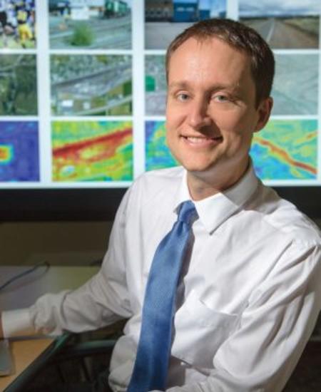
By Kel Hahn
Maps. We usually think of them as geographic tools that accurately identify where places are located. Lately, however, researchers are discovering new ways to take maps to the next level. For instance, computer science associate professor Nathan Jacobs was part of a team that developed a map according to personal taste. Residents in the United Kingdom had been given a set of pictures and asked to assign a number to each picture based on how scenic they thought it was. Jacobs’ team then translated the results into a map of the United Kingdom entirely based on aesthetic taste. An isolated patch of blue (scenic) surrounded by gray (non-scenic) may reveal a hidden treasure worthy of an afternoon hike.
According to Jacobs, who is interested in making maps no one has ever made before, advances in technology and social network data are leading to new kinds of maps with better quality.
“You can make maps of all sorts of things. People have taken social network data and mapped where it was snowing at that moment. It was possible because people were posting geotagged pictures of snow. One group asked volunteers look at Google Street View photos and give each one a score according to whether they thought that place looked safe or not. Then they built a map that illustrated the perceived safety of each location.”
While novel in scope, maps based on social network data alone are limited because images are not available for every location. Filling in the gaps usually leads to low-resolution maps. As a result, Jacobs has begun experimenting with combining ground imagery with satellite imagery.
“Utilizing social network data works well in major tourist areas where people are taking lots of photos, but it doesn’t help in areas that are more non-descript. So you need to be able to match against other images. That is why satellite imagery is so important; it gives us another way to collect imagery.”
For instance, the team’s map of scenic places in the United Kingdom used both ground-level and satellite imagery, which enabled them to produce a more robust map than using ground imagery alone. With that level of detail, it might one day be possible to receive driving directions tagged to a scenic route. Encouraged by his preliminary results, Jacobs has begun applying the same techniques to a variety of areas.
“If you have a map with that kind of resolution, you can do all kinds of useful things with it.”
When Jacobs arrived at the University of Kentucky in 2010, most of his research involved
outdoor webcams. His work on a global webcam archive catalogued more than 16,000 live webcams in the U.S., Europe and parts of Asia and explored how such a repository of images could monitor global trend changes. While a move to satellite imagery might seem like a departure from his earlier research, Jacobs says the overall theme is the same.
“With a webcam, you have a camera fixed in one spot and can trace what a particular scene looks like over time. We did some interesting research with that approach, but it was limited because the cameras are sparsely distributed. We can get farther with social network, Google Street View and now satellite data. So it’s been a natural progression in that we’re trying to expand the set of the different types of images we can work with; however, all of them have the connection that we think about where and when those pictures were taken.”
A map of scenic-ness may illustrate a new way of looking at a particular place, but we can still readily understand it as a map; but what about a map that isn’t about places? That is what Jacobs is investigating with a project he thinks of as Google MapsTM for people.
The yellow bounding box shows the image crop that maximizes scenic-ness. The predicted scenic-ness scores for both the entire image and the cropped region are shown in the inset.
“We took a large data set of images with geotags and then ran a face detector on all of them. Then we built a map where you can zoom in to places all over the world and see what the average person looks like in that exact place. You see a composite picture of the representative face for any age or gender. If you want to see what the average five-year old boy in Japan looks like, you can. I’ve become a dabbler in the world of faces. Another possibility would be that elementary school kids interact with it in social studies classes. They could see what the average kid their age in South Sudan looks like. Actually seeing people from a place you’ve never visited can get rid of a lot of misconceptions.”
A map that elucidates our shared humanity and promotes understanding? One could certainly say we’ve come a long way from sea monsters lurking on the edges of sailing maps!